Tuesday, July 27, 2010

Junk Food Buckets

Well, if you haven't seen the "Junk Food" buckets yet, then you're in for a surprise. These are so cute and inspired by Lynda Angelastro's original Father's Day Junk Food Buckets. They only require 1--12x12 scrapbook page. The page holds enough labels to make two complete buckets. Designs include a top label, front panel label and a hanging gift tag. Clear buckets may be purchased from Michael's for $4.99 each and less if on sale. So they make for a clever but inexpensive gift!

Dad's Junk Food Bucket by Lynda Angelastro which is currently featured in the HM Template Gallery

I've come up with several new designs -- Sweet Girl, Baseball Coach, Popcorn/Movie Night and an adorable Christmas Cookie design. (Please note that the Christmas Cookie design will be released on August 12th into the HM Template Gallery but the others can be ordered now.)

These buckets make wonderful birthday gifts, holiday gifts for neighbors and friends, coaches gifts, and more. I'm also working on a football and basketball coach version which I will upload in the next couple of days.

Thursday, July 15, 2010

Top 10 Design Tips for Creating a Beautiful Design

   #5 [ Use Only 3 Spread Designs Per Storybook ]

Minimize Your Design Work
As beginning designers, you do not need to over complicate your lives with having to come up with 10 different design spreads. Think of the book in terms of creating a simple introduction page, a simple closing page and a few spreads in between.

For the intro and closing of a sports book, such as Hockey, maybe a picture of the coach, some thank you/dedication text and the players names. The closing can just be an autograph page or some closing thoughts.


 Introduction / Dedication


 Closing / Autograph Page


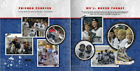
Then all you need to do is come up with 3 different spreads that you really like and then duplicate them. Go to your Manage Pages and simply copy the spread. If you will notice in the example below, my headlines, top bar, photo sizes and placements are all exactly the same. All I've done to make them look different and unique is to change up the papers, change the headlines and pictures and then add a few unique embellishments or quotes.


Note: There is absolutely no need to re-invent the wheel on every spread. Changing simple elements on each page will completely change the look of the spread. I wouldn't place two of the identical spreads back-to-back but I would place a similar page arrangement every 3rd spread. For instance: Intro page, Spread A, Spread B, Spread C, Spread A, Spread B, Spread C, Spread A, Spread B, Spread C, Closing page

DESIGN TIP: Once you have developed your 3 spreads, you can duplicate the pages over and over again. As you begin to feel more comfortable, you might try mixing up some of the spreads that you have created but always make sure that the background remains consistent from page to page.

Sunday, July 11, 2010

Top 10 Design Tips for Creating a Beautiful Design


   #6 [ Work in Spreads ]

Always Think in Terms of Spreads
A lot of different things go into making a design "look good" and look as if it had been professionally designed. Too often beginning designers get stuck in the past -- designing individual pages of a book like they did when they were first beginning the old traditional scrapbooking. Every page was thought of as a single page and scrapbookers only wanted their pages to look cute when slipped into those clear plastic sleeves.

Real hardbound books, such as those Heritage Makers produces, have spreads for a reason. The pages go side by side to paint a picture or complete a thought. Visualizing your book in spreads and using consistent papers or embellishments across the pages is one of the simplest ways to make your book look very pleasing and presentable to the viewer.

Below are examples of a consistent spread and of a non-consistent spread. It's easy to see the difference. The consistent spread easily conveys that there is a continuation of a thought and a flow to the design. Whereas the non-consistent spread looks like two pages put together for no particular reason.


NOTE: By working in spreads, you ultimately save yourself some time. No need to search for additional papers. Use what you've already found and sized. Copy and Paste in Place and you're good to go!

DESIGN TIP: Be Consistent and Work in Spreads! Because Studio 3.0 does not allow you the luxury of working in spreads at this point (only the board book does), you will need to frequently view your project thumbnails down the right hand column under Manage Pages. Also use your Preview function near the upper left hand side of your project, next to the Publish button.

Friday, July 2, 2010

Top 10 Design Tips for Creating a Beautiful Design

   #7 [ Text in Colored Boxes ]

Watch Your Edges When Using Text in Colored Boxes
Be sure that your text is not too close to the edges of the text boxes if you are using a fill color in the background. The default is set so that your text will immediately begin directly inside the edge of your colored box. This is not visually appealing and makes it difficult for the reader.

If you use colored text boxes, be sure you use the Margin Slider on the Toolbox > Tools Tab. This will indent your text appropriately and will allow you to add a little to a lot of space around your text.

The other option is to keep your original text with a clear background and then add a completely separate color filled box in the background.

DESIGN TIP: Use Your Margin Slider. Not too many people know about this tool but it is a very useful one and should be used. You'll find it in your Toolbox under the Tools tab. Experiment with the distance that you like and use that amount consistently throughout your project.

Thursday, July 1, 2010

Top 10 Design Tips for Creating a Beautiful Design

   #8 [ Do NOT use 2 Spaces and Force Justified Copy Blocks ]

Back in the Days of the Typewriter, We Used 2 Spaces After a Period
In body copy, we used to use two spaces after a period during the 'typewriter' age. This was because original typewriters had monospaced fonts. The extra space was needed for the eye to pick up on the beginning of a new sentence. That need is now negated with modern proportional fonts, hence, one space after a period is now the typographic standard. Two spaces is visually distracting and causes ugly holes or blank spots in the body of the text. This makes the body copy both unattractive and distracting to read.

Forced Justified Copy
Forced justified copy can be beautiful when used correctly. It is best used in wide and long copy blocks. Advanced typography is necessary in order to visually wrap text in a way that is most pleasing to the reader.

For the beginning or intermediate designer, I recommend NOT using force justified copy. When you're copy block is short and narrow, ugly gaps appear between the words and make it difficult to read. Give it a try and see what I mean. The only way to learn these techniques is to experiment a little bit and see what makes the most sense.

DESIGN TIP: Use Flush Left Text for Body Copy. I primarily recommend using flush left text for body copy and most headlines. It is the most foolproof of all the variations and works nicely in almost every instance. I do use centered copy occasionally and flush right only in special circumstances as a design calls for it.